Curve fitting plays an import role in iolite’s data reduction pipeline. In order to get accurate results we must have an accurate representation of how our backgrounds and sensitivities are evolving with time. iolite 3’s automatic spline was very good at providing a smooth but not too smooth representation of our data. We wanted to recreate that functionality in iolite 4, but since we no longer have access to Igor Pro’s fitting functions we had to go back to the drawing board.
Scanning the Igor Pro documentation regarding smoothing splines, one can discover that their implementation is based on “Smoothing by Spline Functions”, Christian H. Reinsch, Numerische Mathematik 10, but it also had some iolite special sauce. Hoping to keep our splining relatively consistent from iolite 3 to 4, especially the automatic spline, this algorithm seemed like a good place to start. It turns out that this algorithm is quite popular (> 2500 citations!). One adaptation of this algorithm that also adds generalized cross validation for the automatic choice of smoothing parameter was published in “Algorithm 642: A fast procedure for calculating minimum cross-validation cubic smoothing splines”, M.F. Hutchinson, Transactions on Mathematical Software 12, and it is this algorithm on which iolite 4’s automatic spline is based.
Comparing with iolite 3
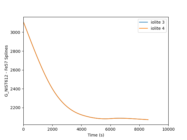
iolite 4 comes with the igor python module bundled so you can read data from pxp files (i.e. iolite 3) in python. We can make use of this module to extract iolite 3 spline data for comparison with iolite 4 after importing an iolite 3 pxp session into iolite 4. See below for one way of doing that.
 1
 2
 3
 4
 5
 6
 7
 8
 9
10
11
12
13
14
15
16
17
18
19
20
21
22
23
24
25
26
27
28
29
30
31
32
33
34
35
36
37
38
39
40
41
42
43
44
|
from igor import packed
import numpy as np
import matplotlib.pyplot as plt

# Specify the group and channel to check:
group_name = 'G_NIST612'
channel_name = 'Fe57'

# Figure out which pxp was imported into iolite 4:
f = data.importedFiles()[0].filePath()
if not f.endswith('pxp'):
	raise RuntimeError('No iolite 3 experiment open?')

# Load that pxp using the igor python module:
d = packed.load(f)[1]

# Get the spline data and time for the group and channel specified for iolite 3:
splines_folder = d['root'][b'Packages'][b'iolite'][b'integration'][b'Splines']
i3spline = splines_folder[b'%b_%b'%(channel_name.encode('utf-8'), group_name.encode('utf-8'))].wave['wave']['wData']
i3t = np.copy(splines_folder[b'TimeWave_%b'%(group_name.encode('utf-8'))].wave['wave']['wData'])
i3t -= i3t[0] # Adjust the time so it starts at 0

# Get the spline data and time for the group and channel specified for iolite 4:
i4spline = data.spline(group_name, channel_name)
i4data = np.copy(i4spline.data())
i4t = np.copy(i4spline.time())
i4t -= i4t[0] # Adjust the time so it starts at 0

# Interpolate the iolite 4 data to be on the same time frame as iolite 3's spline:
i4_3t = np.interp(i3t, i4t, i4data)

# Calculate a percent difference between the two
i4_3t = 100*(i4_3t-i3spline)/i4_3t

# Plot it:
plt.clf()
plt.plot(i3t, i3spline, label='iolite 3')
plt.plot(i4t, i4data, label='iolite 4')
#plt.plot(i3t, i4_3t) # to plot percent diff instead
plt.xlim( (0, 10000) )
plt.lengend()
plt.xlabel('Time (s)')
plt.ylabel('%s - %s Spline %% difference'%(group_name, channel_name))
plt.savefig('/home/japetrus/Desktop/spline_compare.png')
|

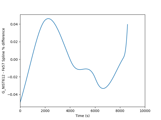
This is fine, but the two splines are almost perfectly on top of each other, so it is easier to see the difference if we plot a percent difference. This requires only a few small changes to the above script to achieve. The output looks as follows where you can see a mere 0.04 % difference between the two.

Comparing different spline types
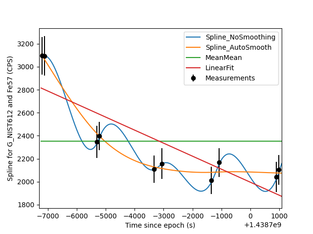
Sometimes it is also nice to see visualize how several different spline types match up with the measured data on which they’re based. The script below is one example of how you can do that.
 1
 2
 3
 4
 5
 6
 7
 8
 9
10
11
12
13
14
15
16
17
18
19
20
21
22
23
24
25
26
27
28
29
30
31
32
|
import matplotlib.pyplot as plt
import numpy as np

# Specify the group and channel to do the comparison for:
group_name = 'G_NIST612'
channel_name = 'Fe57'

group = data.selectionGroup(group_name)

# Make a list of spline types to compare:
stypes = ['Spline_NoSmoothing', 'Spline_AutoSmooth', 'MeanMean', 'LinearFit']

# Collect the measurement data into lists:
x = [s.startTime.toMSecsSinceEpoch()/1000 for s in group.selections()]
y = [data.result(s, data.timeSeries(channel_name)).value() for s in group.selections()]
yerr = [data.result(s, data.timeSeries(channel_name)).uncertaintyAs2SE() for s in group.selections()]

# Plot the measurement data as error bars:
plt.errorbar(x, y, yerr=yerr, xerr=None, fmt='ko', label='Measurements')

# For each of the spline types, get the spline and plot it
for st in stypes:
	group.splineType = st
	s = data.spline(group_name, channel_name)
	plt.plot(s.time(), s.data(), label=st)

# Finish up with the plot:
plt.legend()
plt.xlim( np.min(x)-100, np.max(x) + 100 )
plt.ylabel('Spline for %s and %s (CPS)'%(group_name, channel_name))
plt.xlabel('Time since epoch (s)')
plt.savefig('/home/japetrus/Desktop/spline_test.png')
|

Click here to discuss.
