Sometimes we want to examine the relationship between elements (channels) in our datasets to guide us in our data processing. For example, looking for elements whose concentrations correlate strongly can provide us with ideas about what to plot, or whether our data make sense. Let’s look at a couple of quick ways of looking at these relationships in iolite, taking advantage of existing libraries in python.
In this example, I’ll be using the gabbros dataset that you can download from here (~10 MB) but you can use this code on any data.
A quick correlation matrix as a heatmap
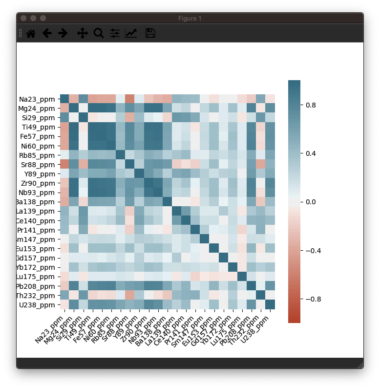
A correlation matrix is just a table of correlation factors comparing each input to every other input. Typically these are shown as a table of numbers, but using the python Seaborn library, we can create a heatmap that shows the correlation factor as a color to help the viewer quickly determine the which elements have some sort of linear relationship.
In this example, we’ll just look at the data for a single selection (the first selection in the group ‘Plag’), but you can easily extend this to all selections. I would recommend using data within selection intervals rather than all the data for a channel. It will be more specific, and won’t include background counts etc.
You can copy and paste the following into a new tab in the Python Workspace to try it out. You may have to replace the whitespace at the start of the lines below the ax.set_ticklabels() and ax.set_xticklabels lines if you receive an indentation error message.
|
|
This should produce a nice heatmap plot that looks something like this:

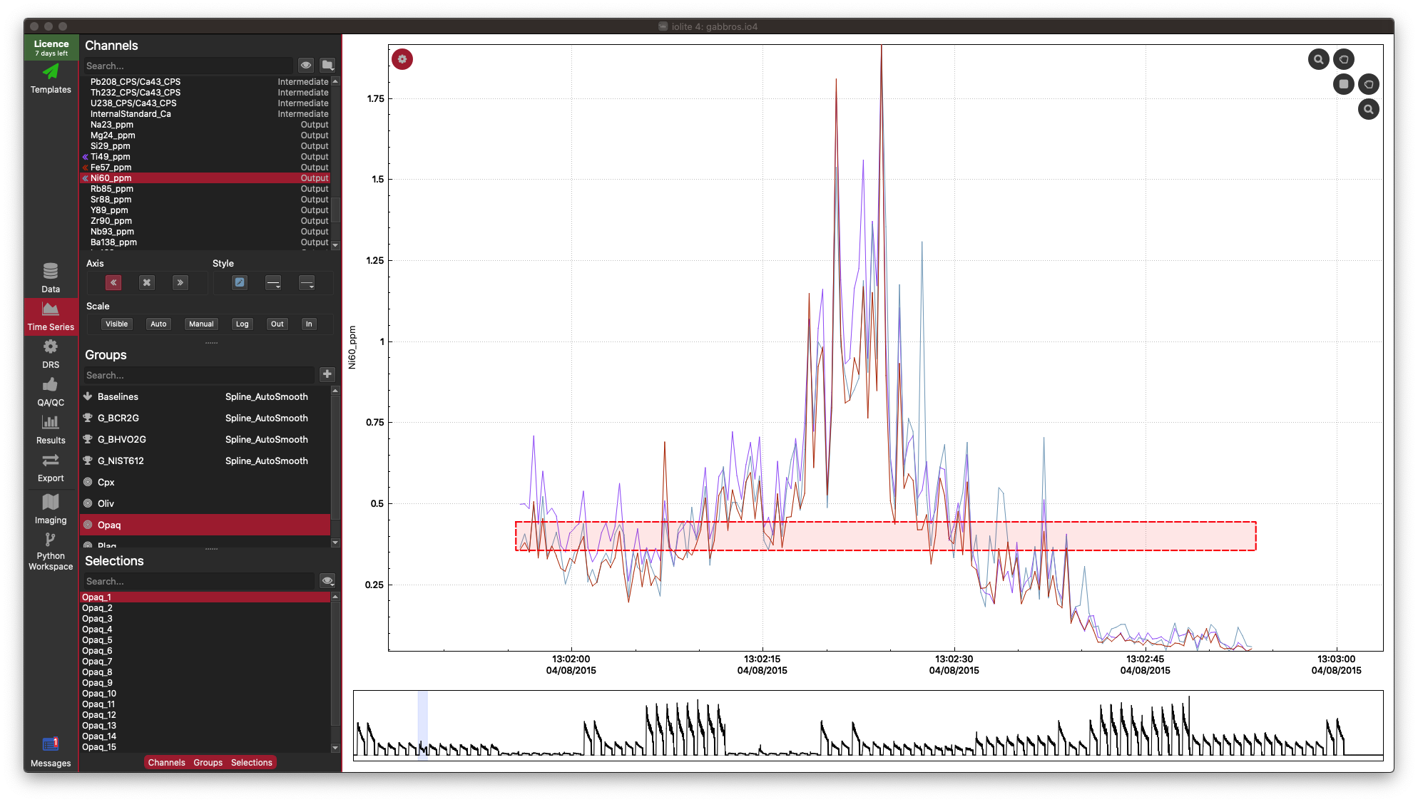
In this example dataset, there is a strong correlation between Fe, Ti and Ni, which is what we would expect for this sample (an Fe-Ti oxide). It’s not necessary, but you can confirm this in the Time-Series View:

In the Time Series View, you can see that Fe (red), Ti (purple), and Ni (aqua) are very well correlated.
Correlation heatmaps are a nice simple way of looking at linear relationships between elements, but correlation coefficients don’t provide information about non-linear releationships, and are exaggerated by outliers. They can also be disturbed when your data forms clusters. However, non-linear relationships are easily picked up by the human eye, and we naturally discard outliers when viewing scatterplots. So let’s look at how to create a scatterplot-matrix.
Creating Scatterplot Matrices using Pandas
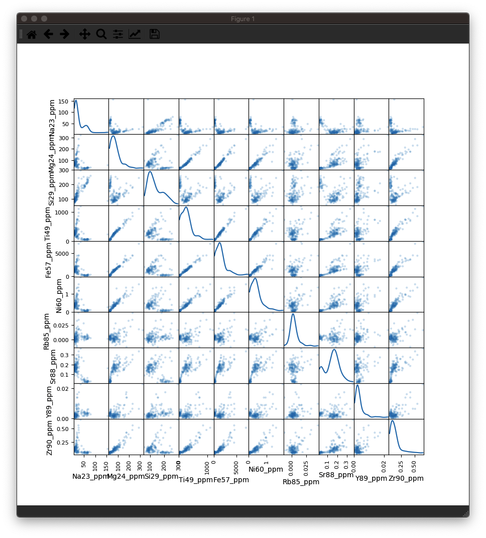
A scatterplot-matrix is exactly as it sounds: a matrix of scatterplots where each plot is one input plotted against another. Instead of showing a 1:1 plot along the diagonal of the matrix, we can instead show a kde (similar to a histogram) to add more information to the plot. In this example, we have many channels, and the plotting function is a little slow, so it might take a few seconds for your plot to appear.
This time we’re just going to plot the first 10 channels of data.
To use this code, just copy and paste it into an empty tab in your Python Workspace:
|
|
You should be able to see something like this:

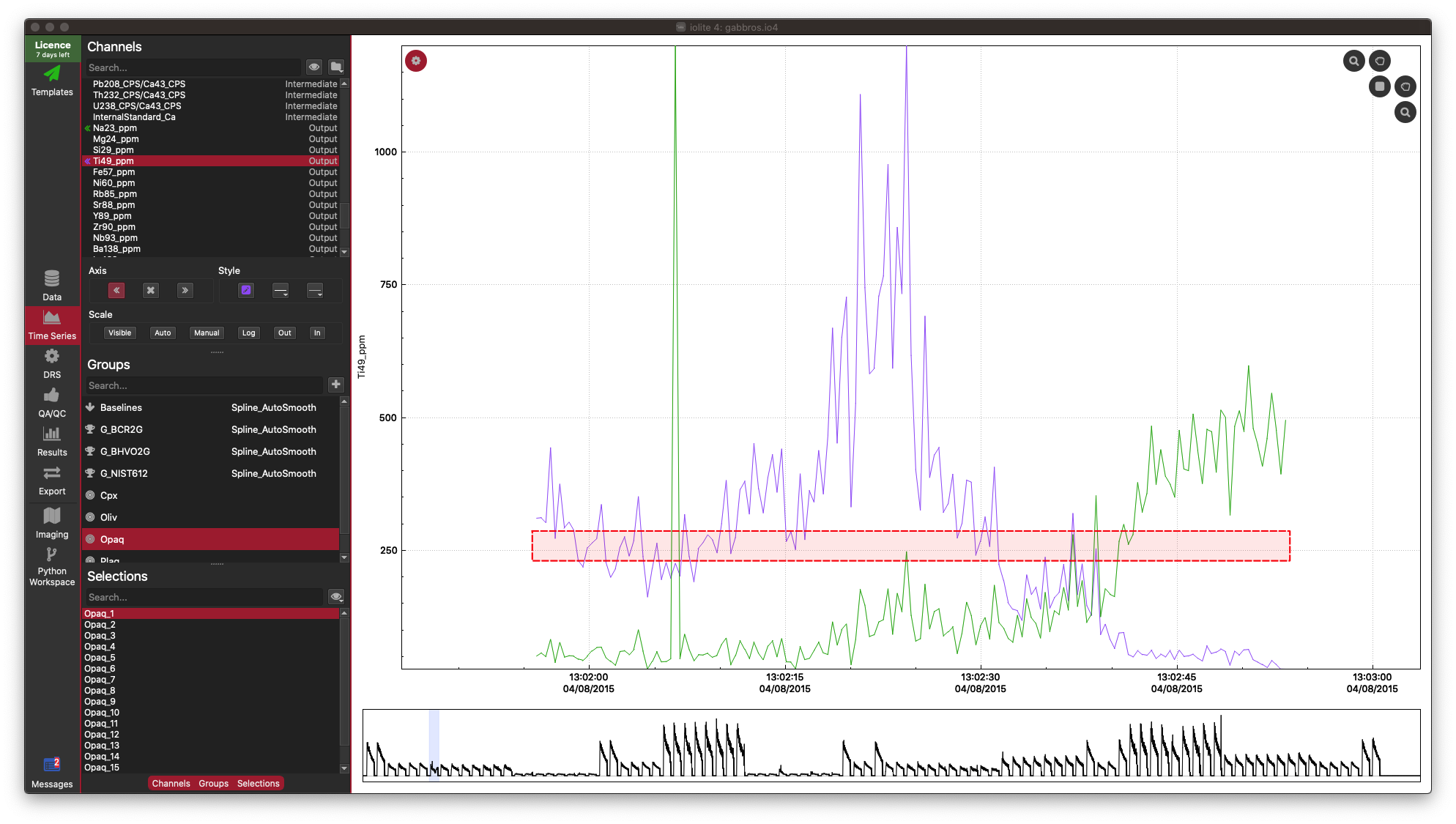
As you can see, there is a lot of information packed into an image like this, and it soon becomes crowded with more than 10 inputs. However, there is more to observe in such plots. For example even though the correlation heatmap showed Na23_ppm was not strongly correlated with other elements (with perhaps the exception of Si29_ppm), we can see in the scatterplots that perhaps there are two clusters of data when plotted against most other elements. This suggests that for this selection we may have ablated more than one phase (mineral). When we look at this selection in time-series (below), we can see that there is a low-Na, higher-Ti period followed by a higher-Na, lower-Ti interval. In this case, it may have simply been a drill through.

This is just a trivial example to show how to plot scatterplot matrices and correlation heatmaps in iolite. These tools can be quite helpful, especially for imaging when it is more likely that you’ll be ablating different phases, tissue types etc.
If you have any questions or suggestions for improvement, please click here to discuss.